- This topic is empty.
-
Topic
-
Data visualization is a valuable tool in the field of User Experience (UX) and User Interface (UI) design. In an increasingly data-driven world, designers are turning to visual representations to uncover insights, enhance user understanding, and make more informed design decisions. From user personas and journey maps to heatmaps and A/B test results, data visualization plays a pivotal role in guiding the creation of intuitive and user-centric digital experiences. This introduction sets the stage for exploring the multifaceted ways in which data visualization is leveraged in UX/UI design, shedding light on its advantages, disadvantages, and real-world applications.
- User Research Data Visualization:
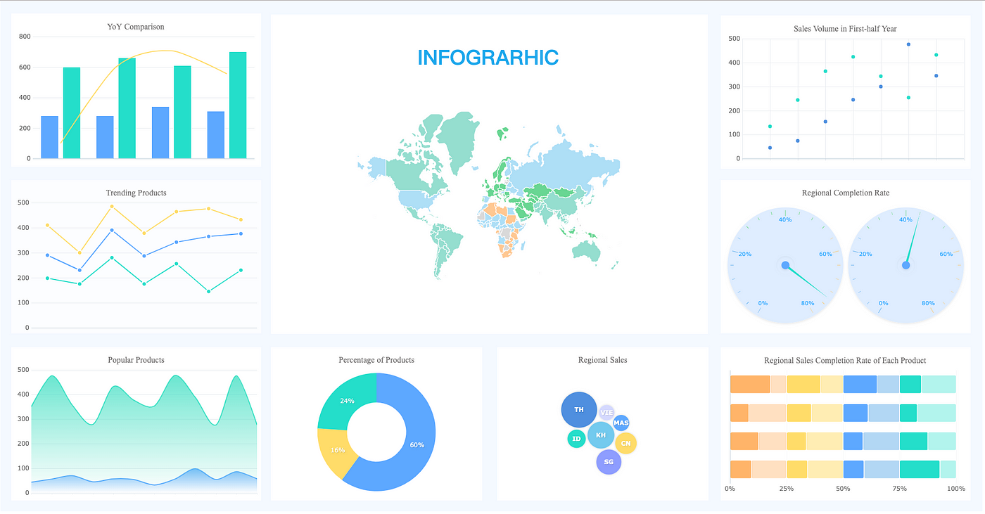
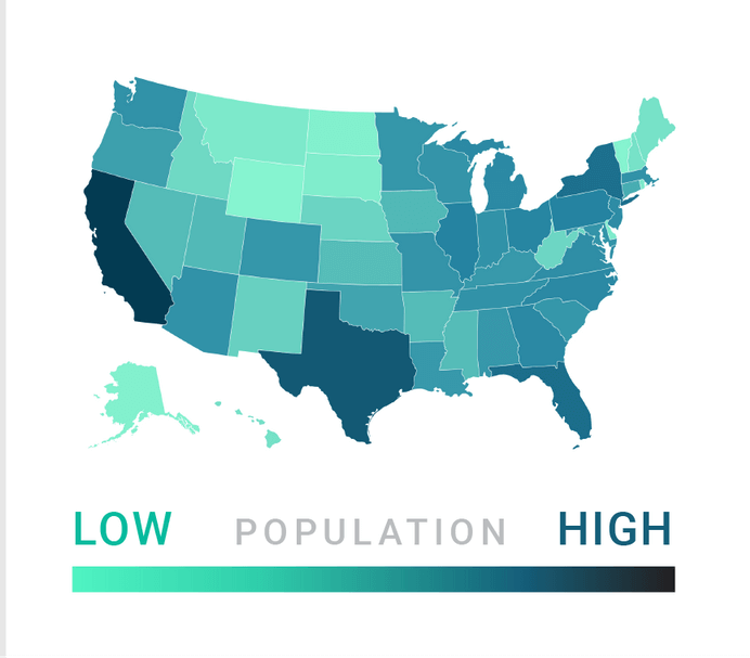
- Use charts, graphs, and infographics to represent user research data, such as user demographics, user preferences, and behavior patterns. This makes it easier to spot trends and insights.
- Persona Creation:
- Visualize user personas with the help of images, icons, and short descriptions. This makes it easier for the design team to relate to and empathize with the target audience.
- Journey Maps:
- Create journey maps that illustrate the user’s experience from start to finish. Visualizing the user’s steps, emotions, and touchpoints helps identify pain points and areas for improvement.
- Heatmaps:
- Use heatmaps to display where users click, move the mouse, or scroll on a website or app. This information can guide UI design decisions, such as button placement or content positioning.
- A/B Testing Results:
- Visualize the results of A/B tests to compare different design versions. This can help in identifying which design elements perform better and guide iterative improvements.
- Usability Testing:
- Visualize usability test results through video recordings, annotations, and summary reports. This helps designers and stakeholders see the issues users encounter.
- Content Strategy:
- Use content hierarchies, mind maps, or visual diagrams to plan and represent content structures, ensuring that information is organized logically and consistently across the UI.
- Information Architecture:
- Visualize information architecture with sitemaps, tree diagrams, or flowcharts to define the structure and navigation of a website or app.
- User Flows:
- Create user flow diagrams to map out the steps a user takes to accomplish specific tasks within the UI. This helps identify bottlenecks and optimize the user journey.
- Accessibility:
- Visualize accessibility considerations by using color contrast checkers, screen reader simulations, or guidelines for accessible design to ensure the UI is inclusive.
- Data Dashboards:
- Develop data dashboards for monitoring user engagement, conversion rates, and other key performance indicators. These dashboards can help UX/UI designers and stakeholders make data-driven decisions.
- Prototyping and Wireframing:
- Use wireframes and interactive prototypes to visualize and test UI designs with stakeholders and users. These low-fidelity representations help refine design concepts.
- User Interface Mockups:
- Create high-fidelity UI mockups and visual designs using tools like Adobe XD, Sketch, or Figma. These visual representations serve as a guide for developers and a reference for design consistency.
- Collaboration:
- Collaborate with other team members and stakeholders by sharing visual representations of your design ideas and concepts. This helps to communicate your vision effectively.
- Feedback Loops:
- Continuously gather feedback from users, team members, and stakeholders using visual aids to improve the design iteratively.
Steps:
- Define Your Objectives:
- Determine the purpose of the data visualization. What specific questions do you want to answer or what insights are you seeking? For example, you might want to understand user behavior, identify pain points, or evaluate the impact of design changes.
- Gather Data:
- Collect relevant data from various sources, including user research, analytics, surveys, and usability testing. Ensure the data is clean, accurate, and well-organized.
- Select the Right Tools:
- Data Preparation:
- Clean, filter, and format the data as needed. Ensure that the data is in a suitable format for the chosen visualization tool. You might need to perform data transformation or aggregation.
- Identify Key Metrics:
- Determine the key performance indicators (KPIs) or metrics that are relevant to your design objectives. These metrics will be the focus of your visualizations.
- Choose Visualization Types:
- Select the appropriate types of visualizations (e.g., bar charts, line graphs, heatmaps, or infographics) that best represent your data and support your objectives. The choice of visualization should be based on the nature of the data and the insights you want to convey.
- Design the Visualizations:
- Create the visualizations with a focus on clarity and simplicity. Use color, typography, and layout principles to ensure that the information is presented in a user-friendly and aesthetically pleasing manner.
- Create User Personas:
- If your data visualization pertains to user demographics or behavior, create user personas and include them in your design. This can help stakeholders relate to the data more easily.
- Iterate and Test:
- Share the initial visualizations with your team, stakeholders, or even users, and gather feedback. Make iterative improvements based on the feedback to ensure the visualizations effectively convey the desired information.
- Incorporate Visualizations into Design:
- Use the insights gained from the visualizations to inform your UX/UI design decisions. This might involve changing interface elements, improving user flows, or optimizing content placement.
- Create Prototypes and Mockups:
- Translate your design decisions into wireframes, interactive prototypes, and high-fidelity UI mockups. Ensure that the visualizations are integrated into the design to create a seamless user experience.
- Testing and Validation:
- Test your designs with real users to ensure that the changes made based on the data visualizations result in an improved user experience. This could involve usability testing, A/B testing, or other testing methods.\
- Feedback and Refinement:
- Continue to gather feedback and iterate on your designs. Data visualization can be an ongoing process, and you should be open to making adjustments based on user feedback and evolving data.
- Documentation and Reporting:
- Document the findings and design changes made based on data visualization. Share this documentation with your team and stakeholders to keep everyone informed.
- Presentation and Communication:
- Present your data visualizations and design changes to stakeholders and team members using clear, engaging, and persuasive communication. Use visual aids to illustrate your points effectively.
Advantages
- Clarity and Comprehension:
- Visual representations of data are often easier to understand than raw data or text. Data visualizations make complex information more accessible and comprehensible, which is essential for both designers and stakeholders.
- Identifying Patterns and Trends:
- Data visualizations can reveal patterns, trends, and insights that may not be apparent when looking at numbers or textual data alone. This helps designers make data-driven decisions and improvements to the user interface.
- Effective Communication:
- A powerful means of communicating data and design ideas to team members, stakeholders, and clients. They can make it easier to explain the rationale behind design decisions and create a shared understanding.
- User Empathy and Personas:
- Visualizations, such as user personas, can humanize data by representing it as relatable individuals. This helps designers empathize with users and design more user-centric interfaces.
- Early Detection of Issues:
- By visualizing usability testing results or user behavior data, designers can quickly identify pain points and areas of improvement in the user experience. This allows for early intervention and iterative design changes.
- Support for Decision-Making:
- Provide evidence-based support for design decisions. Designers can point to data visualizations to justify design changes, making it more likely that stakeholders will accept and implement these changes.
- Efficiency in Data Analysis:
- Make data analysis more efficient. Designers can quickly spot anomalies, outliers, or issues in the data, saving time compared to manually sifting through rows of data.
- Enhanced Collaboration:
- Fosters collaboration among team members and stakeholders. Designers can collaborate more effectively with developers, product managers, and marketers, ensuring that everyone is on the same page regarding design decisions.
- Information Hierarchy and Content Strategy:
- Help in planning the information hierarchy, content structure, and layout of user interfaces. They can ensure that information is organized logically and displayed in a user-friendly manner.
- Better User Flows:
- User flow diagrams and visualizations can help designers map out user journeys and identify areas for optimization. This leads to more intuitive and efficient user flows.
- Iterative Design:
- Can be used at various stages of the design process, allowing for continuous iteration and improvement. Designers can make informed design changes based on ongoing data analysis.
- Increased Engagement:
- Interactive data visualizations and dashboards can be engaging for users and stakeholders, encouraging them to explore data and design concepts in a more interactive way.
- Accessibility and Inclusivity:
- Can be used to ensure that design decisions align with accessibility standards. They help designers identify potential accessibility issues related to color contrast, text size, and screen reader compatibility.
- Goal Tracking and KPIs:
- Visualizations of key performance indicators (KPIs) and metrics provide a clear way to track progress toward design and business goals. This enables continuous improvement and alignment with objectives.
Disadvantages
- Misinterpretation of Data:
- Poorly designed visualizations or miscommunication of the data can lead to misinterpretation. Stakeholders or team members may draw incorrect conclusions or make misguided design decisions based on the visualizations.
- Overemphasis on Quantitative Data:
- Relying too heavily on quantitative data can neglect the qualitative aspects of user experience. While data visualization is excellent for quantitative insights, it may not capture the nuances and emotions that affect user behavior.
- Data Privacy and Security Concerns:
- Using sensitive user data for visualization may raise privacy and security concerns. Designers must ensure that they handle and represent data responsibly and in compliance with data protection regulations.
- Complexity and Overloading Information:
- Complex visualizations can overwhelm users or stakeholders with too much information, making it difficult to discern the most crucial insights. It’s essential to strike a balance between detail and simplicity.
- Limited Context:
- Data visualizations may not always provide a complete context. They can show what users are doing but not necessarily why they are doing it. Designers need to dig deeper to uncover the underlying reasons for user behavior.
- Bias and Data Quality Issues:
- Biases and data quality problems in the source data can propagate into the visualizations. Designers must be aware of potential biases and inaccuracies in the data they work with.
- Resource Intensive:
- Creating and maintaining them can be resource-intensive. Designers may need to invest time and effort in learning visualization tools and ensuring the data is up-to-date.
- Subjectivity in Design:
- The design of visualizations can be subjective, and different designers may interpret and present data differently. This subjectivity can introduce bias into the design process.
- Accessibility Challenges:
- Some visualizations may present accessibility challenges for users with disabilities. For example, complex charts or graphs may not be easily understood by individuals who rely on screen readers.
- Learning Curve:
- Learning how to create effective data visualizations can be challenging, especially for designers who are not experienced in data analysis or visualization tools. This can result in less-than-optimal visualizations.
- Overemphasis on Data at the Expense of Creativity:
- Focusing too much on data can stifle creativity in design. Designers may become overly constrained by the data and overlook innovative design solutions.
- Data Overload for Users:
- In the final user interface, presenting too much data to users can overwhelm them. The challenge is to strike a balance between showing relevant data and not overloading the interface.


- User Research Data Visualization:
- You must be logged in to reply to this topic.

