- This topic is empty.
-
Topic
-
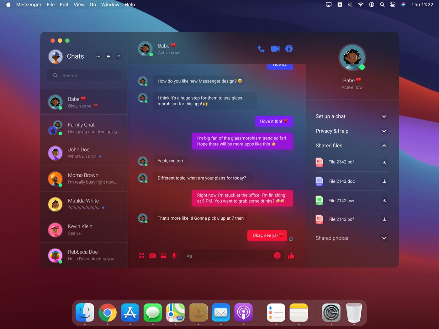
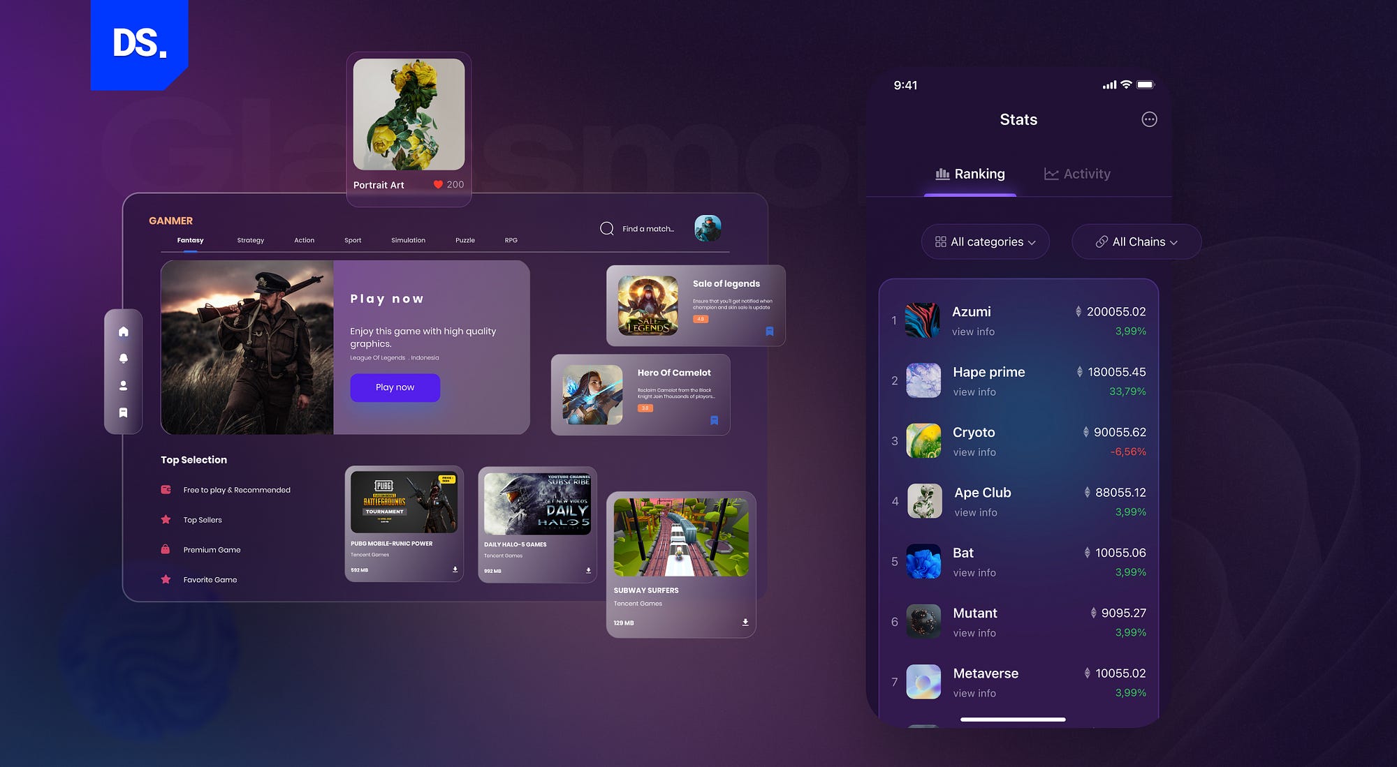
Glassmorphism is a design trend in the field of user interface (UI) and user experience (UX) design that emerged around 2020. It is characterized by a frosted glass-like or translucent aesthetic, where elements on the screen appear to be made of glass or acrylic materials, giving them a sense of depth, blur, and a soft, frosted appearance. This design trend is often used to create visually appealing and modern interfaces for websites, mobile apps, and other digital products.
Key features and characteristics:
- Transparency: Heavily relies on transparent or semi-transparent elements, such as panels, cards, or buttons. These elements allow users to see through them to some extent, creating a sense of depth and layering.
- Frosted Blur: To simulate the frosted glass effect, designers apply a Gaussian blur or frosted glass texture to the background behind transparent elements. This blurring effect helps to obscure the content behind the glass, making it partially visible but not entirely clear.
- Vibrant Colors: Often incorporates vibrant and eye-catching colors, which can create a visually appealing contrast against the frosted glass background.
- Minimalistic Design: Many glassmorphism designs follow a minimalistic approach, with clean and simple layouts. The emphasis is on clarity and ease of use while maintaining a visually appealing aesthetic.
- Depth and Layers: Designers use multiple layers of transparent elements to create a sense of depth and hierarchy within the interface. This can help users understand the content’s organization and importance.
- Realistic Lighting: The use of shadows and lighting effects can enhance the realism of the glass-like elements, making them appear more tactile and interactive.
- Accessibility: While glassmorphism can be visually appealing, it’s essential to ensure that the design remains accessible to all users, including those with visual impairments. Proper contrast, text legibility, and usability should not be compromised.
Steps:
- Define Your Design Goals:
- Start by understanding the purpose and goals of your project. What kind of application or website are you designing, and who is your target audience?
- Gather Design Inspiration:
- Research and gather design inspiration from existing glassmorphism examples. Explore websites, mobile apps, or design portfolios that use this style to get a better understanding of its elements and possibilities.
- Choose Your Color Palette:
- Select a color palette that includes vibrant and contrasting colors. Glassmorphism often features bright, eye-catching hues against the frosted glass background.
- Layout and Hierarchy:
- Plan your layout and hierarchy of elements. Decide what content should be emphasized and how it will be organized on the screen.
- Background Frosted Glass Effect:
- Create a frosted glass effect for your background using design software like Adobe Photoshop, Sketch, or Figma. This involves applying a Gaussian blur or frosted glass texture to a semi-transparent background element. Make sure it doesn’t overpower the content.
- Transparent UI Elements:
- Design your UI elements, such as buttons, cards, or panels, to be semi-transparent. These elements should appear as if they are floating on the frosted glass background.
- Depth and Layers:
- Use multiple layers of transparent UI elements to create a sense of depth and hierarchy in your design. Arrange elements to ensure that more important content stands out.
- Text and Typography:
- Ensure that text is legible against the frosted glass background. Use high-contrast colors and choose a readable font. Consider using drop shadows or outlines for text to improve readability.
- Icons and Imagery:
- Design or select icons and images that fit the glassmorphism style. These should also be semi-transparent and have a frosted appearance. Ensure they harmonize with the overall design.
- Shadows and Lighting:
- Apply shadows and lighting effects to your UI elements to make them appear more tactile and interactive. These shadows should simulate the way light interacts with glass surfaces.
- Testing and User Feedback:
- Test your design with potential users or stakeholders to gather feedback. Ensure that the glassmorphism style doesn’t hinder usability or accessibility.
- Refinement:
- Based on user feedback and testing results, refine your design as needed. Make adjustments to improve usability and overall user experience.
- Implementation:
- Work with developers to implement your glassmorphism design into the final product. Ensure that the design is faithfully translated into code, including the transparent and frosted glass effects.
- User Interface Animation (Optional):
- Consider adding subtle animations or transitions to your glassmorphism design to enhance user engagement and provide visual feedback for interactions.
- Accessibility Considerations:
- Throughout the design and development process, pay attention to accessibility guidelines and make necessary adjustments to ensure that the glassmorphism design is accessible to all users.

Advantages
- Visual Appeal: Can create visually stunning and modern interfaces that catch users’ attention. The frosted glass effect and vibrant colors often make designs aesthetically pleasing.
- Depth and Dimension: The use of transparency and layers in glassmorphism provides a sense of depth and dimension, making the interface feel more interactive and tactile.
- Clarity and Hierarchy: The transparency and layering of UI elements can help users understand the hierarchy of content and the relationships between different elements on the screen, leading to a clearer user experience.
- Engagement: The visual effects can enhance user engagement by making the interface feel interactive and responsive, which can lead to increased user satisfaction.
- Modernization: Can give older or outdated interfaces a modern and fresh look without completely overhauling the design, making it a cost-effective way to update the visual style of a product.
- Versatility: While glassmorphism is often associated with certain color palettes and visual effects, it can be adapted to various design styles and themes, making it versatile for different types of projects.
- Brand Differentiation: When applied thoughtfully, glassmorphism can help your product or brand stand out from competitors by offering a unique and distinctive visual style.
- Accessibility: While it requires careful attention to detail, glassmorphism can be made accessible to a wide range of users with proper contrast, text legibility, and other accessibility considerations.
- Innovation: By embracing design trends like glassmorphism, designers and organizations can demonstrate innovation and a willingness to stay current with design practices, which can be appealing to users.
- User Engagement: The frosted glass and layered design elements can encourage users to explore the interface further, potentially leading to increased interaction and longer user sessions.

Disadvantages
- Usability and Legibility: Excessive use of transparency and frosted glass effects can compromise the usability and legibility of the interface. Text and content may become difficult to read or interact with, especially for users with visual impairments.
- Accessibility Concerns: Achieving accessibility in glassmorphism designs can be challenging. Ensuring proper contrast, text readability, and keyboard navigation may require extra effort to meet accessibility standards.
- Performance Impact: The use of transparency, blurring, and layered elements can impact the performance of the application, especially on devices with limited processing power or slower internet connections.
- Overuse: Like any design trend, overuse of glassmorphism can lead to design fatigue. If many apps and websites adopt this style, it may lose its uniqueness and appeal.
- Complexity: Implementing it can be more complex than traditional flat design. Designers and developers need to have the necessary skills and tools to achieve the desired effects effectively.
- Inconsistent Platform Support: Achieving the glassmorphism effect consistently across various platforms and devices can be challenging. Different browsers and operating systems may render transparency and blurring effects differently.
- Impact on Performance: Heavy use of transparency and layered elements can increase the load time and resource consumption of a digital product, potentially leading to slower user experiences.
- Readability Challenges: The frosted glass effect, when applied excessively, can make it challenging to read text and view content clearly, which can be frustrating for users.
- Complexity in Maintenance: Maintaining and updating glassmorphism designs can be more challenging than simpler design styles. Changes and updates may require more effort to ensure that the design remains consistent and visually appealing.
- Incompatibility with Branding: May not align with the branding and identity of all organizations or products. It may not be suitable for conveying a specific message or image.
- Limited Applicability: May not be appropriate for all types of digital products or industries. Some projects, such as highly technical or professional applications, may require a more conservative or functional design approach.
- You must be logged in to reply to this topic.

