- This topic is empty.
-
Topic
-
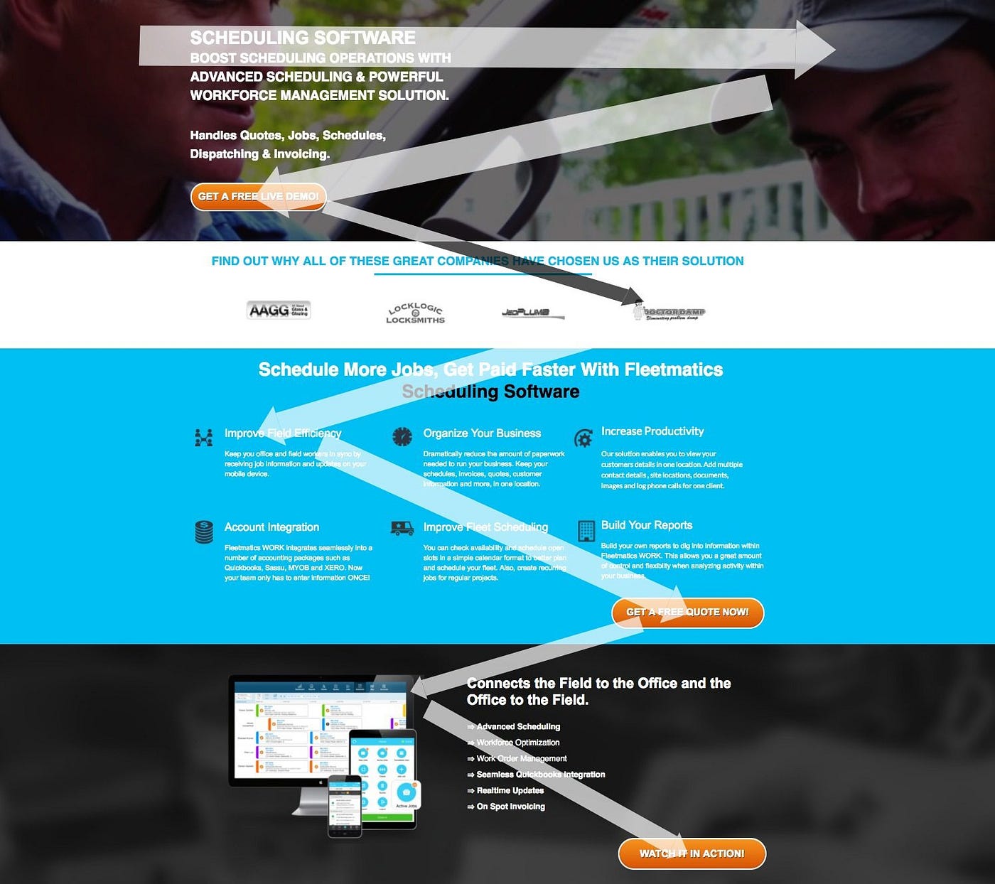
The “Z” layout is a design concept used in various fields, including graphic design, web design, and interior design. It is a way of arranging elements in a visual composition to guide the viewer’s eye through the content.
The “Z” layout gets its name from the fact that the viewer’s eye follows a path that roughly resembles the letter “Z.” The layout starts at the top left corner of the design, moves diagonally across to the right, then down to the bottom left corner, and finally across to the right again.
In graphic design and web design, it is often used to organize information in a way that is easy to follow and visually engaging. The most important information is typically placed at the beginning of the “Z” path, while less important information is placed towards the end.
In interior design, it can be used to guide the flow of traffic through a space. For example, in a living room, the seating area may be arranged in a way that follows the “Z” path, with the sofa at the beginning, a coffee table in the middle, and a pair of chairs at the end.
Steps
- Determine the hierarchy of the content: Identify the most important information that needs to be conveyed and determine its placement on the “Z” path. This information should be positioned at the beginning of the path, where the viewer’s eye will naturally start.
- Create the “Z” path: Use design elements such as lines, shapes, or images to create a path that follows the “Z” pattern. This path should guide the viewer’s eye through the content in a logical and visually appealing way.
- Place the elements: Arrange the design elements along the “Z” path, with the most important information at the beginning of the path, followed by less important information towards the end.
- Use contrast: Use contrast to create visual interest and draw the viewer’s eye to specific elements along the “Z” path. This can be achieved through the use of color, size, or typography.
- Consider the overall composition: Step back and review the design as a whole to ensure that it is balanced and visually appealing. Make adjustments as needed to create a harmonious and effective composition.
Advantages
- Easy to follow: Naturally follows the way people read and scan content, making it easy for viewers to follow the flow of information in a design.
- Effective for conveying information: By placing the most important information at the beginning of the “Z” path, viewers are more likely to notice and retain that information.
- Creates a clear hierarchy: Allows designers to create a clear hierarchy of information, with the most important information placed at the beginning of the path and less important information towards the end.
- Enhances visual appeal: Can make a design more visually engaging by creating a clear path for the eye to follow and using contrast to draw attention to specific elements along the path.
- Useful for multiple design fields: Applied in various design fields, including graphic design, web design, and interior design, making it a versatile and widely applicable concept.
Disadvantages
- Can become predictable: Popular design concept, which means that it can become predictable if overused or used without variation. This can make a design appear generic or boring.
- May not work for all types of content: While it works well for content that follows a logical sequence, it may not be as effective for content that is more random or abstract.
- Can be limiting: May not allow for as much creative freedom as other design concepts, as it relies on a specific path and hierarchy of information.
- Requires careful balancing: Requires careful balancing to ensure that the design is visually appealing and effective. If not executed properly, it can create a disjointed or confusing design.
- May not be suitable for all design contexts: While it can be used in various design fields, it may not be suitable for all design contexts. For example, it may not be the best choice for designs that require a more free-form or experimental approach.


- You must be logged in to reply to this topic.

