- This topic is empty.
-
Topic
-
Usability heuristics are a set of general principles or guidelines that help designers evaluate and improve the usability of user interfaces. These heuristics were first introduced by Jakob Nielsen and Rolf Molich in the early 1990s and have since become a widely used framework in the field of user interface design.
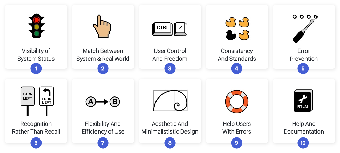
Here are the ten cited usability heuristics:
- Visibility of System Status: The system should always keep users informed about what is happening through appropriate feedback within a reasonable amount of time. Users should be able to understand the current state of the system and their actions’ impact.
- Match between System and the Real World: The system should speak the users’ language, with words, phrases, and concepts familiar to the users. It should follow real-world conventions and use metaphors that are understandable to the target audience.
- User Control and Freedom: Users often make mistakes. The interface should provide a clearly marked “emergency exit” to leave the unwanted state without having to go through an extended dialogue. It should allow users to undo and redo actions and recover from errors easily.
- Consistency and Standards: Users should not have to wonder whether different words, situations, or actions mean the same thing. Consistency in design, layout, and terminology enhances user familiarity and reduces the need for mental effort.
- Error Prevention: The interface should be designed to minimize the occurrence of errors. This includes sensible default settings, confirmation for irreversible actions, and clear error messages with suggestions for recovery.
- Recognition rather than Recall: Minimize the user’s memory load by making objects, actions, and options visible. The user should not have to remember information from one part of the interface to another. Instructions should be readily available when needed.
- Flexibility and Efficiency of Use: The interface should cater to both novice and experienced users. It should allow users to accomplish tasks efficiently once they become proficient, using shortcuts, accelerators, and customization options.
- Aesthetic and Minimalist Design: The interface should be visually pleasing and maintain a minimalist design. Avoid unnecessary elements and information that could distract users from their primary tasks.
- Help Users Recognize, Diagnose, and Recover from Errors: Error messages should be in plain language, precisely indicate the problem, and suggest a constructive solution to resolve the issue.
- Help and Documentation: Provide clear and accessible help documentation to assist users in understanding the system’s features and how to use them effectively. However, the design should aim to be intuitive enough that users seldom need to refer to the documentation.
These heuristics are not strict rules but guidelines that can inform and enhance the design process. Depending on the specific context and target audience, you may need to adapt and prioritize these heuristics to suit your project. Regular usability testing with real users is vital to identify specific issues and opportunities for improvement in the user interface.

- You must be logged in to reply to this topic.