- This topic is empty.
-
Topic
-
A logo is more than just a visual identifier; it encapsulates a brand’s essence, values, and identity in a single, often simple, graphic. The best logos are timeless, versatile, and memorable, leaving a lasting impression on consumers. Let’s look at ten of the best-designed logos, analyzing what makes them iconic and effective.
1. Apple
The Bite of Innovation

Apple’s logo, a sleek, monochrome apple with a bite taken out, is a paragon of simplicity and sophistication. Designed by Rob Janoff in 1977, the logo has evolved to reflect Apple’s focus on innovation and design excellence. The bite was included to ensure the apple wouldn’t be mistaken for a cherry, adding a layer of practicality to its elegant form.
2. Nike
The Swoosh of Motion

The Nike Swoosh, created by graphic designer Carolyn Davidson in 1971, symbolizes speed, movement, and athleticism. Its fluid, dynamic shape conveys a sense of motion that aligns perfectly with the brand’s “Just Do It” ethos. The logo’s simplicity and versatility make it instantly recognizable on everything from shoes to sports equipment.
3. Coca-Cola
Script of Tradition

Coca-Cola’s logo, with its distinctive Spencerian script, has remained largely unchanged since its creation in 1886 by Frank Mason Robinson. The flowing, cursive lettering embodies the brand’s heritage and timeless appeal. The red and white color scheme adds to its visibility and recognition, making it one of the most enduring logos in history.
4. FedEx
Hidden Excellence

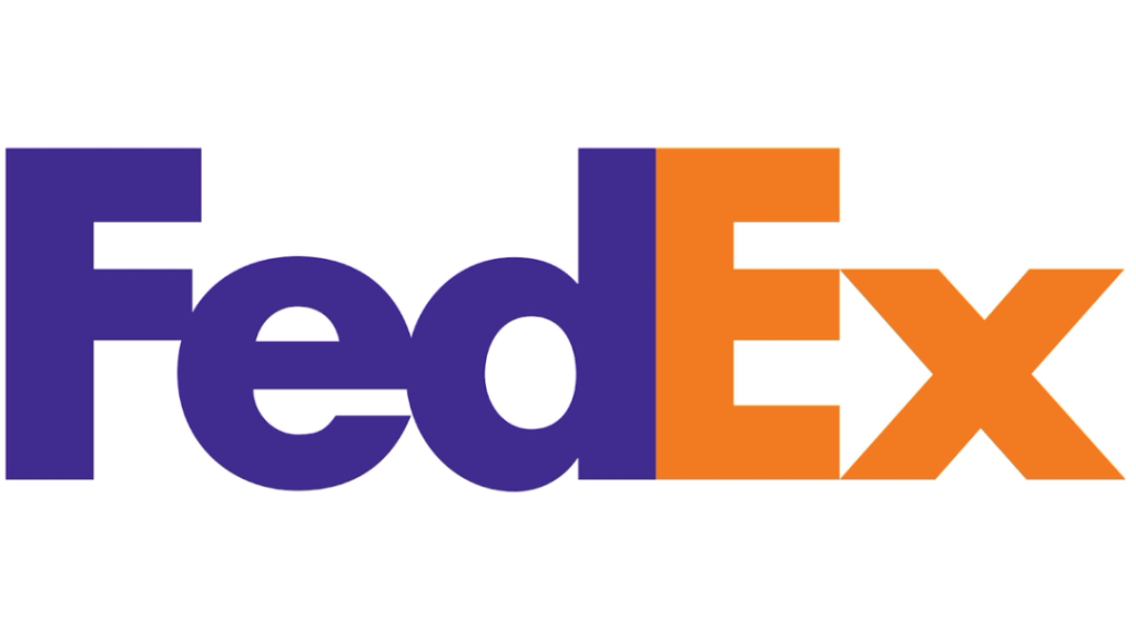
The FedEx logo, designed by Lindon Leader in 1994, is celebrated for its clever use of negative space. The hidden arrow between the “E” and “x” subtly conveys speed and precision, key attributes of the courier company. This ingenious design element, combined with clean, bold typography, makes the FedEx logo a standout example of modern logo design.
5. McDonald’s
Golden Arches of Familiarity

The Golden Arches of McDonald’s are one of the most recognizable symbols in the world. Introduced in the 1960s, the logo’s bold, yellow arches represent the letter “M” and evoke a sense of happiness and comfort. The simplicity and brightness of the design make it instantly identifiable, reinforcing McDonald’s brand identity.
6. Starbucks
Siren of Connection

Starbucks’ logo, featuring a twin-tailed siren, is rooted in the company’s maritime origins in Seattle. The green circle and the siren symbolize the brand’s connection to the sea and the coffee trade. The logo has undergone several refinements since its inception in 1971, but its core imagery remains, highlighting the brand’s commitment to quality and heritage.
7. Google
Playful Simplicity

Google’s logo, designed by Ruth Kedar, is known for its simplicity and playfulness. The use of primary colors with a secondary color for the “L” breaks the pattern, reflecting Google’s unconventional approach. The clean, sans-serif typography and vibrant colors convey accessibility and innovation, key elements of Google’s brand.
8. Mercedes-Benz
Star of Excellence

The Mercedes-Benz logo, a three-pointed star within a circle, symbolizes the brand’s domination of land, sea, and air. Introduced in 1926, the logo represents the brand’s engineering excellence and luxury. Its sleek, silver design exudes elegance and sophistication, aligning with Mercedes-Benz’s reputation for high-quality automotive design.
9. Adidas
Stripes of Performance

The Adidas logo, featuring three parallel stripes, is a symbol of performance and quality. The stripes, initially part of the shoe design, became the brand’s signature mark. The current logo, a minimalist rendition of the three stripes forming a mountain, conveys the idea of overcoming challenges and achieving greatness.
10. Amazon
Smile of Customer Satisfaction
Amazon’s logo, with its arrow stretching from “A” to “Z,” represents the vast selection of products available on the platform. The arrow also forms a smile, signifying customer satisfaction and the brand’s commitment to a positive shopping experience. The simple, clean design and clever use of imagery make the Amazon logo both functional and memorable.
These ten logos show the power of design in creating strong brand identities. Each logo is a masterpiece of simplicity, symbolism, and strategic thinking, contributing significantly to the brands’ success and recognition. In a world where first impressions matter, these logos exemplify how great design can encapsulate a brand’s essence and leave a lasting impact.
- You must be logged in to reply to this topic.

