- This topic is empty.
-
Topic
-
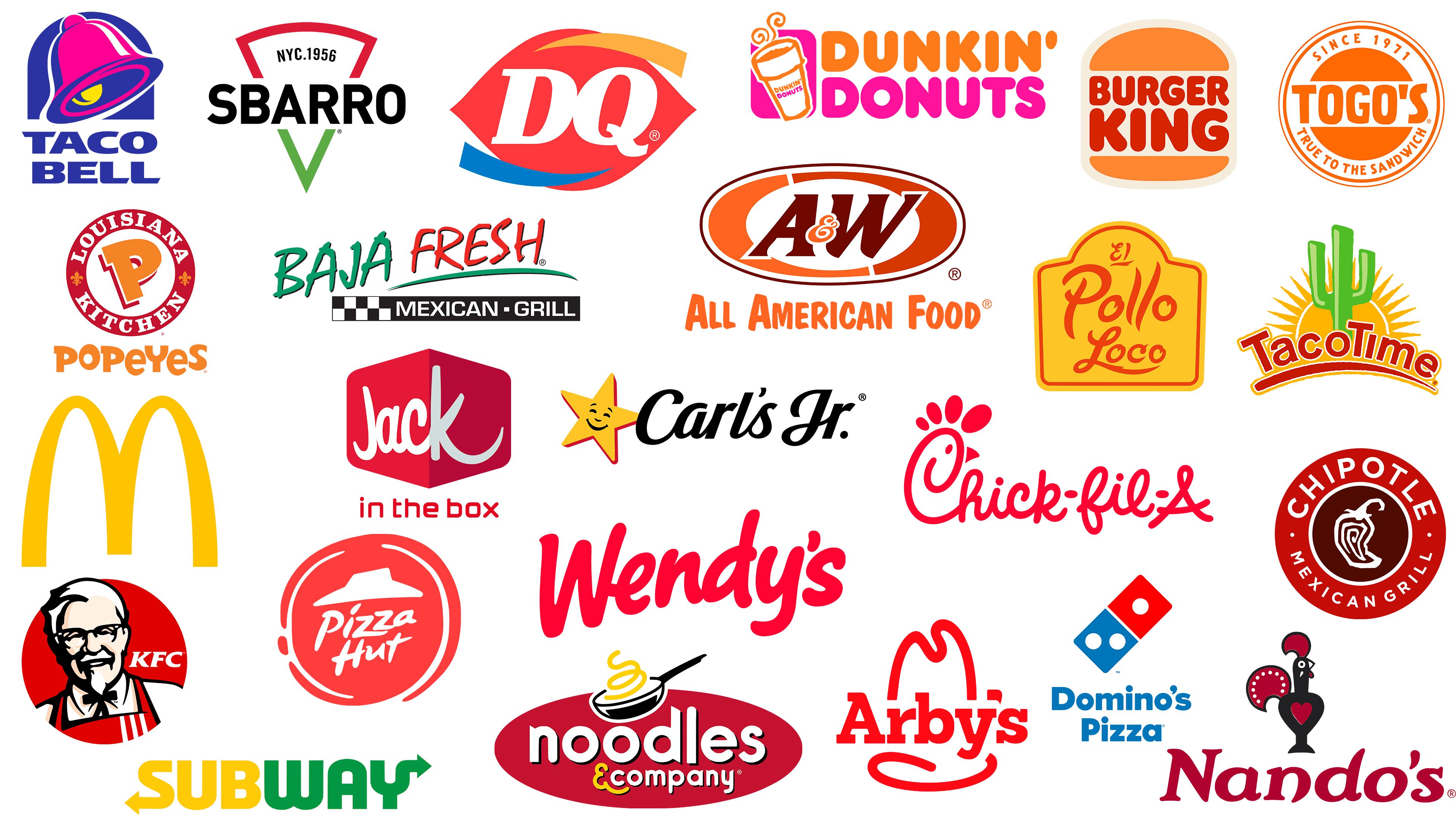
Logos play a crucial role in brand identity, especially in the fast food industry, where competition is fierce and visual recognition is key. A great logo not only conveys the brand’s message but also evokes emotions and memories. Here’s a look at ten of the best fast food brand logos, highlighting their design elements and the psychology behind them.
1. McDonald’s
Design Elements:
- Golden Arches: The iconic “M” shape is instantly recognizable.
- Color Scheme: Bright yellow and red create a vibrant, appetizing atmosphere.
The golden arches symbolize a friendly and inviting experience, while the red and yellow colors are known to stimulate appetite. The simplicity and boldness of the logo contribute to its memorability, making it one of the most recognized symbols globally.
2. Burger King
Design Elements:
- Bun Shape: The logo resembles a hamburger, with the brand name sandwiched between two buns.
- Color Palette: A combination of red, yellow, and blue.
The playful design directly reflects the product being sold, reinforcing the brand’s identity. The bright colors invoke energy and excitement, appealing to a younger demographic. The rounded shapes also add to the friendliness of the brand.
3. KFC (Kentucky Fried Chicken)
Design Elements:
- Colonel Sanders: The silhouette of the founder gives a personal touch.
- Color Scheme: Predominantly red and white.
The use of Colonel Sanders in the logo emphasizes tradition and authenticity. The red background conveys warmth and comfort, while the white adds a clean, fresh feel. This logo effectively connects consumers to the rich heritage of KFC.
4. Taco Bell
Design Elements:
- Bell Icon: The stylized bell is a clear representation of the brand’s name.
- Color Palette: Purple and pink with a white background.
The bell not only signifies the brand but also evokes a sense of fun and excitement. The vibrant colors are eye-catching and modern, appealing to a younger audience looking for a casual dining experience. The logo reflects a sense of playfulness that aligns with the brand’s offerings.
5. Subway
Design Elements:
- Arrows: The logo features two arrows that signify freshness and movement.
- Color Scheme: Green and yellow, with an emphasis on freshness.
The green color represents health and freshness, aligning with Subway’s focus on fresh ingredients. The arrows create a sense of direction and speed, appealing to busy consumers looking for quick, healthy options. The logo is simple yet effective in communicating the brand’s mission.
6. Wendy’s
Design Elements:
- Girl Icon: The playful, cartoonish representation of Wendy.
- Color Palette: Red, white, and blue, with a vintage feel.
Wendy’s logo evokes nostalgia with its retro style, appealing to a sense of comfort and familiarity. The cheerful face of Wendy promotes a friendly atmosphere, while the color scheme reflects a classic American feel, aligning with the brand’s identity.
7. Domino’s Pizza
Design Elements:
- Domino Icon: The logo features a simple domino graphic with dots representing the brand’s name.
- Color Palette: Red, blue, and white.
The domino icon clearly relates to the brand’s name and products. The color scheme is bold and straightforward, effectively conveying the message of quick delivery and freshness. The simplicity of the design makes it easily recognizable, even from a distance.
8. Starbucks
Design Elements:
- Mermaid Icon: The logo features a two-tailed mermaid encircled by the brand name.
- Color Scheme: Green and white.
The mermaid symbolizes the brand’s maritime heritage, while the green color evokes a sense of calm and relaxation. The circular design creates a badge-like feel, making it an emblem of quality coffee. The logo reflects Starbucks’ commitment to providing a unique experience.
9. Pizza Hut
Design Elements:
- Hat Icon: The logo features a stylized red roof resembling a hut.
- Color Palette: Red and black, with a simple font.
The red roof design is instantly recognizable and evokes a sense of comfort. The use of bold colors and simple typography emphasizes the brand’s straightforward approach to providing delicious pizza. The logo conveys a sense of home and family.
10. Chipotle
Design Elements:
- Circular Logo: The logo features a stylized burrito, encircled by the brand name.
- Color Scheme: Earthy tones of red and brown.
The circular design represents inclusivity and community, aligning with Chipotle’s brand ethos of fresh, responsibly sourced ingredients. The earthy colors convey a sense of naturalness, appealing to health-conscious consumers looking for quality food.
The logos of these ten fast food brands are more than just visual symbols; they embody the essence of their respective brands. Through thoughtful design elements, color schemes, and emotional resonance, these logos have successfully created strong brand identities that resonate with consumers worldwide. As the fast food landscape continues to evolve, these logos will remain iconic representations of the brands they symbolize.

- You must be logged in to reply to this topic.