- This topic is empty.
-
Topic
-
The Rolex logo is one of the most recognizable and iconic logos in the world of luxury watches. It has remained relatively unchanged since its inception. Overview of the Rolex logo history:
- Early Logo (1905-1919): When Rolex was founded in 1905 by Hans Wilsdorf and Alfred Davis in London, England, the early Rolex watches featured a simple text-based logo. It consisted of the brand name “ROLEX” written in all capital letters, with no specific font style.
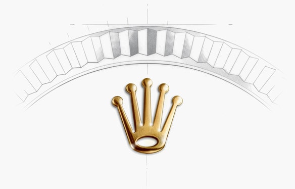
- Crown Logo (1925-Present): In 1925, Rolex registered the five-pronged crown logo, which has become synonymous with the brand. The crown logo was designed to symbolize the precision and excellence of Rolex watches. The logo features a highly stylized crown, with a small, curved line under the word “ROLEX” to signify the text as a part of the logo.
- Color Variation (1930s-2003): While the basic design of the crown logo has remained consistent, there have been some variations in its color. From the 1930s until the early 2000s, Rolex used a two-tone logo with a golden crown and green lettering. This combination emphasized the brand’s association with luxury and the color green became closely associated with Rolex.
- Modern Variation (2003-Present): In 2003, Rolex made a subtle change to its logo. The color of the text “ROLEX” changed from green to silver, matching the color of the crown. This change brought a more unified and refined look to the logo, while still maintaining the brand’s visual identity.
The Rolex logo has remained consistent in its core design, featuring a crown as a symbol of the brand’s precision and quality. The logo’s longevity and recognition have contributed to Rolex’s reputation as a prestigious and sought-after watchmaker.


- You must be logged in to reply to this topic.