- This topic is empty.
-
Topic
-
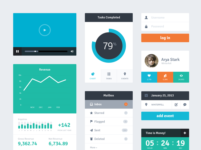
Flat UI is a design trend that has become popular in recent years, particularly in the field of user interface (UI) design. The term “flat” refers to a design aesthetic that emphasizes simplicity, clarity, and minimalism, using simple elements such as basic shapes, clean typography, and bright colors.
In a flat UI design, elements are stripped of texture, gradients, and other visual embellishments that can create depth and realism. Instead, the focus is on creating a clean and uncluttered design that is easy to understand and navigate. This approach is often seen in modern website and mobile app designs, which aim to provide a smooth and seamless user experience.
The designs are also typically responsive, meaning they adapt to different screen sizes and orientations. This is important because users may access the same website or app on a variety of devices, such as a desktop computer, tablet, or smartphone. With a flat UI design, the layout and content can adjust to fit the screen size and maintain usability and visual appeal.
Steps:
- Simplify the design: Simplicity is key. To achieve this, the design should be stripped of any unnecessary elements or visual clutter. Focus on using basic shapes, simple typography, and bright colors.
- Choose a color scheme: Designs are typically use bright, bold colors that help to create a clean and modern look. Choose a color scheme that is consistent throughout the design and complements the brand or product.
- Use typography effectively: Typography plays an important role in flat UI design. Use clear, easy-to-read fonts that are consistent throughout the design. Avoid using too many different fonts or styles, as this can create visual clutter.
- Create a hierarchy of information: Important to establish a clear hierarchy of information. This helps users to understand the content and navigate the interface more easily. Use size, color, and placement to create a visual hierarchy.
- Incorporate white space: White space, or negative space, is an important element of flat UI design. It helps to create a clean and uncluttered look, and can also make the design more readable and easier to navigate.
- Test and refine the design: Once the design is complete, it’s important to test it thoroughly and make any necessary refinements. Get feedback from users and make changes as needed to improve the user experience.
Advantages
- Clarity and simplicity: Are stripped of unnecessary elements and visual clutter, creating a clean and uncluttered interface. This makes it easier for users to understand the content and navigate the interface, improving the overall user experience.
- Responsiveness: Typically responsive, meaning they can adapt to different screen sizes and orientations. This is important in today’s world, where users access websites and apps on a variety of devices.
- Speed and performance: Because flat UI designs are simpler and less complex, they can load faster and perform better than more complex designs.
- Consistency: Often use a consistent color scheme, typography, and layout, creating a cohesive and visually appealing interface.
- Accessibility: Can be more accessible to users with disabilities, such as those who are visually impaired. This is because the design is typically simpler and easier to navigate than more complex designs.
- Modern and up-to-date: Modern and up-to-date design trend, which can make a website or app feel fresh and relevant to users.
Disadvantages
- Lack of depth: Can lack depth and dimensionality, which can make them feel less realistic or immersive than more complex designs.
- Difficulty in highlighting important elements: With a minimalist design, it can be challenging to highlight important elements without resorting to more complex design techniques.
- Over-simplicity: Over-simplifying a design can sometimes lead to a lack of information or detail, making it difficult for users to understand the content.
- Limited creativity: Relies heavily on basic shapes, typography, and color, which can limit the creative possibilities compared to more complex designs.
- Limited brand personality: Sometimes feel generic and lack personality or brand identity, which can be important for some businesses or organizations.
- Potential for overuse: Because they are a popular trend, there is a risk of overusing them, which can make a website or app look too similar to others and less memorable.

- You must be logged in to reply to this topic.
