- This topic is empty.
-
Topic
-
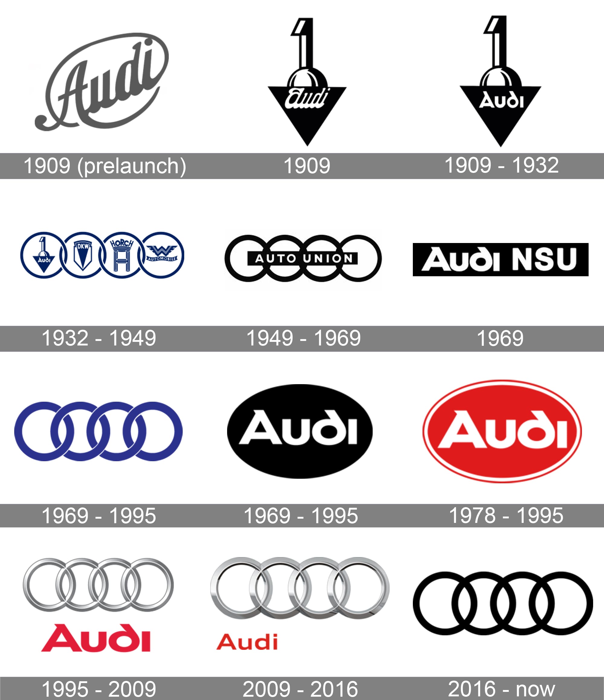
The Audi logo has evolved over time while maintaining some consistent elements. A summary of the evolution of the Audi logo:
- Initial Logo (1909): The company that would later become Audi, known as August Horch Automobilwerke GmbH, had a logo featuring the name “Horch” within a diamond shape. August Horch, the founder of the company, had to leave the company due to trademark issues, and a new name was needed.
- First Audi Logo (1932): After August Horch left his previous company, a new brand called Audi Automobilwerke GmbH was established. The first Audi logo featured four interconnected rings, each representing one of the four founding companies: Audi, Horch, Wanderer, and DKW. The logo symbolized the union of these companies under the umbrella of Auto Union.
- Auto Union Logo (1932-1969): The interconnected rings of the Audi logo continued to represent the four companies of the Auto Union consortium. The logo underwent slight modifications during this period, with the rings becoming more streamlined and refined.
- Audi NSU Auto Union Logo (1969-1985): In 1969, Auto Union merged with NSU Motorenwerke AG, forming Audi NSU Auto Union AG. The logo featured the four interlocked rings in a more stylized and modern design, with the company name written below.
- Simplification of Logo (1985-2009): In 1985, the logo underwent a significant simplification. The rings were further streamlined and appeared in a flat, chrome-like design. The company name was removed from the logo, leaving only the four rings.
- Modern Audi Logo (2009-Present): The current Audi logo was introduced in 2009. It retains the four rings, but they are given a three-dimensional, glossy appearance. The rings are spaced evenly, creating a more balanced and cohesive look. The company name, “Audi,” is typically displayed separately from the logo.
- Variations and Adaptations: While the core elements of the logo remain consistent, Audi has occasionally introduced variations for specific models or special editions. These variations may incorporate different colors, backgrounds, or additional design elements while still maintaining the essential interconnected rings.
The Audi logo has evolved over time, reflecting the brand’s history and growth while remaining rooted in its original symbolism. The four rings continue to represent the heritage and union of the companies associated with Audi, symbolizing the brand’s commitment to engineering excellence and automotive innovation.


- You must be logged in to reply to this topic.

