- This topic is empty.
-
Topic
-
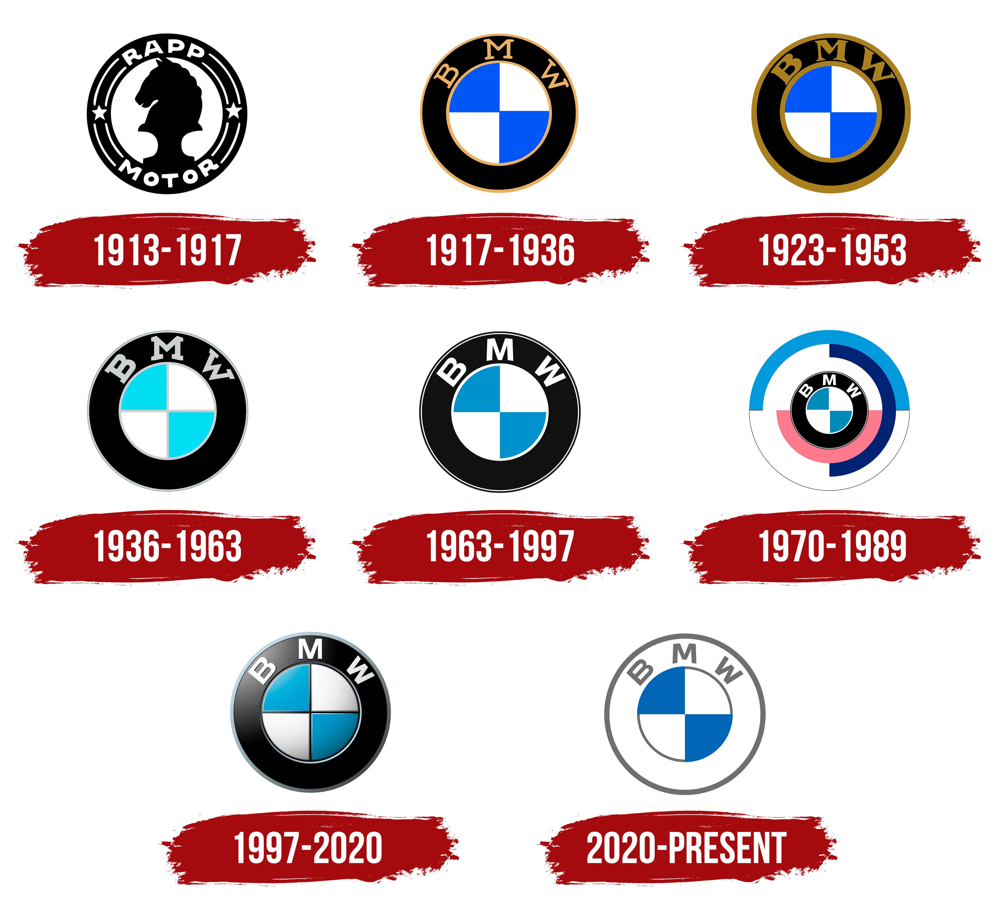
The BMW logo has a fascinating history, and it has evolved over time. Overview of the BMW logo’s evolution:
- Early Logo (1917-1920): The first logo used by Bayerische Motoren Werke (BMW) was a circular design with the letters “BMW” at the center. The letters were stylized in a black and white pattern, representing the company’s original name, Bayerische Motoren Werke.
- Aircraft Engine Heritage (1920-1929): During this period, BMW transitioned from manufacturing aircraft engines to automobiles. The logo featured a roundel with the blue and white colors of the Bavarian flag, symbolizing the company’s Bavarian roots. The inner circle contained the letters “BMW” in black.
- Simplification (1933-1945): In 1933, the BMW logo underwent a simplification process. The outer circle remained blue with the white segments representing the Bavarian flag. The letters “BMW” were placed in a black circle, creating a more compact and unified design.
- Post-War Revival (1945-1953): After World War II, BMW faced a temporary halt in production. When it resumed, the logo featured a simplified design with the outer blue circle and white segments of the Bavarian flag. The company name was spelled out in black within the circle.
- Introduction of the Propeller Myth (1953): In the 1950s, an advertising campaign sparked a popular myth associating the BMW logo with a spinning aircraft propeller, suggesting the brand’s aviation heritage. While this connection was not historically accurate, the myth became widely accepted and associated with BMW.
- Current Logo (1953-Present): The current BMW logo was introduced in 1953 and has remained relatively unchanged since then. It features a circular blue and white emblem with the white segments representing the Bavarian flag. The inner circle contains the iconic white letters “BMW” in a stylized font.
- 3D Effect: In recent years, the BMW logo has undergone a subtle update with a 3D effect, adding depth and dimension to the design. This update aims to enhance the logo’s modern and dynamic appearance while retaining its recognizable elements.
The BMW logo represents the company’s commitment to engineering excellence and its Bavarian heritage. It is recognized worldwide as a symbol of luxury, performance, and innovation. The logo’s evolution reflects the evolution of the brand itself, from its early days as an aircraft engine manufacturer to its current status as a leading automotive manufacturer.


- You must be logged in to reply to this topic.


