- This topic is empty.
-
Topic
-
The Bentley logo is one of the most recognizable and iconic automotive logos in the world. It consists of a stylized letter “B” enclosed within a set of wings. The logo’s design and history are closely tied to the origins and development of the Bentley brand.
- Creation of the Bentley Brand:
-
- The Bentley brand was founded by Walter Owen Bentley, known as W.O. Bentley, in 1919 in Cricklewood, London.
- Bentley initially focused on manufacturing high-performance cars and racing vehicles.
-
- The First Bentley Logo (1919-1927):
-
-
- The first logo used by Bentley during its early years featured the brand name “Bentley” spelled out in a bold, uppercase serif font.
- This logo was typically displayed on the radiator grille of Bentley vehicles.
-
-
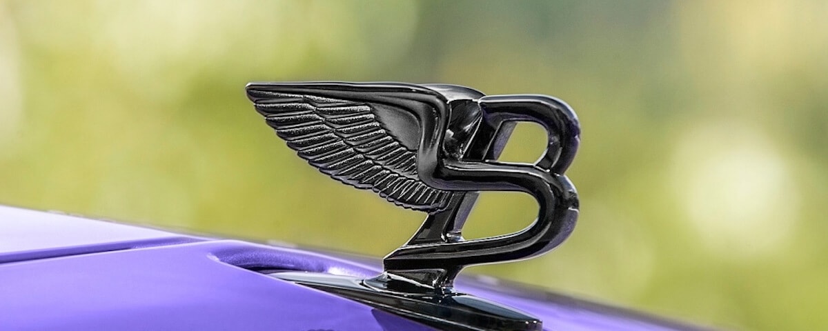
- The Bentley Winged “B” Logo (1927-Present):
-
- In 1927, a significant change occurred with the introduction of the winged “B” logo.
- The logo was designed by a friend of W.O. Bentley, Frederick Gordon Crosby, who was also a renowned artist and designer.
- The new logo featured a stylized capital letter “B” enclosed within a pair of wings.
- The wings symbolize the brand’s racing heritage, speed, and elegance.
- The winged “B” logo is typically displayed on the hood ornament, the front grille, and other prominent locations on Bentley vehicles.
- Over the years, slight modifications have been made to the logo’s design, primarily in terms of refinement and detail.
-
- Evolution of the Winged “B” Logo:
-
-
- In the early years, the wings in the logo were elongated and extended beyond the letter “B.”
- In 1960, a more streamlined and compact version of the logo was introduced. The wings became shorter and symmetrical, fitting snugly around the letter “B.”
- The overall shape of the logo was refined and simplified, giving it a more modern and sleek appearance.
- Since then, the logo has undergone subtle modifications in terms of proportions and minor stylistic adjustments to maintain its relevance and visual appeal.
-
The Bentley winged “B” logo has become synonymous with the brand’s luxurious and high-performance vehicles. It represents the heritage, craftsmanship, and refined engineering that Bentley stands for, making it one of the most recognizable automotive logos in the world.


This logo is a stylized letter-B with the hawk’s wings sitting proud behind it. This bonnet logo is featured on some of Bentley’s most luxurious and powerful models.
- Creation of the Bentley Brand:
- You must be logged in to reply to this topic.