- This topic is empty.
-
Topic
-
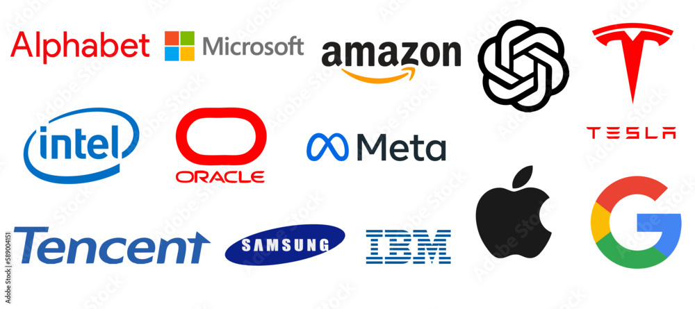
Creating a memorable and effective logo is essential for tech brands, as it often serves as the first point of interaction with customers. Here’s an exploration of ten of the best tech brand logos, delving into what makes them stand out and their significance in the industry.
1. Apple
Logo Design: The Apple logo features a minimalist apple silhouette with a bite taken out of it, usually rendered in a monochrome palette.
Significance: The simplicity of the Apple logo embodies the brand’s philosophy of elegance and user-friendliness. It’s easily recognizable and has become synonymous with innovation and quality in consumer electronics.
2. Google
Logo Design: Google’s logo consists of the word “Google” in a playful, colorful typeface, using blue, red, yellow, and green.
Significance: The bright colors represent diversity and creativity, aligning with Google’s mission to organize the world’s information. The logo’s simplicity and fun approach reflect the brand’s accessibility and friendliness.
3. Microsoft
Logo Design: Microsoft’s logo features the company name next to a square divided into four colored quadrants (red, green, blue, and yellow).
Significance: The four quadrants symbolize the company’s diverse product range, from software to hardware. The logo conveys a modern and professional look, representing reliability and innovation.
4. IBM
Logo Design: The IBM logo consists of the letters “IBM” in bold, uppercase letters, often represented in a blue color scheme with horizontal stripes.
Significance: The blue color evokes trust and dependability, while the stripes suggest progress and a forward-thinking approach. The logo is timeless and has evolved to represent a company that stands at the forefront of technology.
5. Tesla
Logo Design: Tesla’s logo is a stylized letter “T,” resembling a shield or a lightning bolt.
Significance: The logo reflects Tesla’s commitment to innovation in electric vehicles. Its sleek and modern design aligns with the brand’s image as a pioneer in sustainable technology and energy solutions.
6. Intel
Logo Design: Intel’s logo features the name “Intel” in a bold, sans-serif font, often accompanied by the tagline “Intel Inside” and enclosed in a blue oval.
Significance: The logo’s design emphasizes reliability and trustworthiness, vital for a brand known for its processors and technology. The blue color signifies intelligence and innovation, making it instantly recognizable in the tech industry.
7. Amazon
Logo Design: Amazon’s logo features the brand name in lowercase letters with a curved arrow pointing from the letter “A” to “Z.”
Significance: The arrow signifies that Amazon sells everything from A to Z, reflecting the company’s vast product range. The smiley face created by the arrow adds a friendly touch, promoting customer satisfaction and service.
8. Spotify
Logo Design: Spotify’s logo is a simple green circle with three black sound waves inside.
Significance: The logo conveys a sense of movement and sound, representing the streaming service’s core function. The bright green color is energetic and modern, appealing to the younger demographic that Spotify targets.
9. Samsung
Logo Design: Samsung’s logo features the company name in a bold, blue oval shape.
Significance: The simplicity and clarity of the logo convey a sense of reliability and innovation. The blue color represents trust, while the oval shape suggests a global presence, emphasizing Samsung’s position as a leader in the tech market.
10. NVIDIA
Logo Design: NVIDIA’s logo includes the brand name alongside a stylized eye icon.
Significance: The eye symbolizes vision and innovation, fitting for a company known for its graphics processing units (GPUs). The green color reflects growth and creativity, representing NVIDIA’s dedication to pushing technological boundaries in gaming and AI.
The logos of these ten tech brands exemplify the power of design in branding. Each logo not only represents the company’s identity but also communicates its values and mission. A well-designed logo can create an immediate connection with consumers, making it an essential aspect of a tech brand’s overall marketing strategy. Through simplicity, color psychology, and meaningful symbolism, these logos have successfully captured the essence of their respective brands and have become iconic in the tech industry.

- You must be logged in to reply to this topic.